
DECEMBER 2016 - SOMETHING WICKED, THIS WAY COMES...
‘QUOTH THE RAVEN...’
The idea to paint this one has been brewing for a while. Edgar Allan Poe’s The Raven has been one of my all-time favourite poems for some time, plus I’d always loved James Earl Jones’ telling of it in The Simpson’s Halloween: Treehouse of Terror episode, ‘The Raven’
Although associated with Halloween, the poem’s setting is actually in the month of December, hence me braving the elements − well, not exactly, because despite the cold it was mainly sunny, blue skies − to get it done.
I had planned to write out verses 1, 2, 7 and 8, but left out most of verse 2 and all of verse 7, due to having very cold hands during the process.
Still, it was a very enjoyable experience, and one which I’m sure will be repeated.
 |
| The completed verse 1, and the opening lines of verse 2. |
 |
| With the completed verse 8, it’s now time for a little painting. |
 |
| The painting of the raven, under the light of the silvery moon.. |
‘SHE’S A ROGUE, THAT ONE!’
There was always gonna be a sequel, so here it is...
Combining 2 concepts as one − The first, celebrating the latest ‘Wars’ movie, Rogue One, the second, continuing the story arc of Theresa May as a pop culture villain. This time, she’s in the form of Grand Admiral Thrawn, an Imperial villain from the Star Wars Universe, as you can see here.
Thrawn regularly has a ysalamir on his shoulder, whereas this Admayral is featured with her very own pet... Boris!
Sad, yet true, but in a time soon to come, such paintings will be seen as ‘Art, imitating life, imitating Art, imitating life’. Let’s see how much she ‘grows’ into these roles...
 |
| Although the wall was already painted white, I felt it better to break it up with the use of black. |
 |
| Laying the foundation for the chief villain − the Admayral. |
 |
| After Boris, her hair and a few background details, the piece is complete. |
INTRODUCING, K-2SO
As it was a warm-ish, sunny day − despite it being December, I had a go at painting another character from the new Star Wars film, K-2SO. He’s a former Imperial security droid that’s been reprogrammed to work for the Rebel Alliance.
It was a little refreshing painting this one, as it gave me a good contrast to the Admayral piece I’d just completed. Kay-Too (K-2SO) looked technical − being a droid, but the execution of it was a little freer, more ‘loose’.
All in all, it was a fun & productive day out.
 |
| Detail close-ups of the visage and neck of the droid, K-2SO. |
 |
| Another close-up of some of the detail, showing a few of the techniques deployed. |
 |
| The completed K-2SO portrait marks another successful project. |
 |
| Showing both sides of the struggle, here’s a shot of the finished mural in its entirety. |
THE REBELS’ PRINCESS
WOW!! Few could have predicted 2016 being the year that it’s been. Politically, socially, globally − especially with regard to the Music, Movie and Cultural icons that have been taken from us. From January right through to December, the Grim Reaper has just been kicking us in the nuts, week after week, month after month. It’s like it’s the freakin’ Rapture! That being said, it was still a total shock when we heard that Carrie Fisher − best known to most for her role as Princess Leia in 6 Star Wars movies (yes, I’m gonna be geeky here & mention not only the Original Trilogy, but Episodes VII, VIII and ‘technically’ Rogue One − plus give her character [not her, per se] an honorary mention for the end of Episode III, which sort of brings it to a tenuous 7), passed away on Tuesday, December 27.
Carrie, in her 2008 autobiography, Wishful Drinking, had joked that she wanted her obituary to be inspired by a funny exchange she'd had with Star Wars director, George Lucas.
“George [Lucas] comes up to me the first day of filming and he takes one look at the dress and says, 'You can't wear a bra under that dress ... because there is no underwear in space,’” Fisher wrote, recalling the conversation she had with Lucas about the white dress she wears as Princess Leia in the original 1977 film. “I promise you this is true, and he says it with such conviction too!" she added. “Like he had been to space and looked around and he didn't see any bras or panties or briefs anywhere.”
According to the late actress, Lucas joked that if she wore underwear in space and her body expanded, she would “get strangled by [her] own bra.”
“Now I think that this would make for a fantastic obit,” Fisher continued. “So I tell my younger friends that no matter how I go, I want it reported that I drowned in moonlight, strangled by my own bra.”
Now, wouldn’t that be a way to go!
The life of Carrie Fisher, as well as her character of Princess Leia inspired boys and girls, men and women alike, the world over. Showing us that a woman’s place, is definitely in the Resistance!
 |
| Part-way through my colourful tribute to Star Wars' Carrie Fisher, on a South London Wall. |
 |
| With the iconic hairstyle in place, it's time to work on the other details of the painting. |
 |
| I decided to give it a title, linking the character she was best known for, with the present global situation. |
 |
| The completed Carrie Fisher/Princess Leia mural. A reminder not just of what we’ve lost, but also what we have to gain. |
------------------------------------------------------------------------------------------------------------------------------------------
NOVEMBER 2016 - WE WILL REMEMBER...!
‘HE LED THE CHARGE FROM FOOTBALL FIELDS...'
There are untold stories that his-story books don’t even glance at, let alone skim through, and sadly, these stories can be more inspiring and equally important than the usual narrative which we are indoctrinated with in school. One such story, is that of Walter Tull.
The life and story of Walter Tull is not just a story about race, but is a universal tale of humanity, bravery, heroism, dignity and triumph in the face of overwhelming odds, both from the enemy on the battlefield and those with whom he served. Men whom by their own choice, chose to see him − and others of African origin who fought for Britain and the Allies − as an enemy, instead of a friend, colleague, and brother in arms.
Walter Tull was a professional footballer who played for Tottenham Hotspur then later Northampton. When the First World War broke out in 1914, he decided to enlist in December of that year, giving up his career as a footballer. Despite racism within the army, Walter proved to be an exceptional soldier and rose through the ranks, fighting at the Battle of the Somme as a sergeant and then being promoted to second lieutenant, despite a military rule which excluded “negroes” from becoming officers. After leading his company of 26 men to safety in Italy, Tull was cited for “gallantry and coolness”, although he never received a Military Cross.
Tull was killed at age 30 near the village of Favreuil in the Pas-de-Calais region of France, and his body was never recovered. However, he is remembered at the Arras memorial for those who have no known grave.
Phil Vasili, who wrote Tull’s biography, Walter Tull, 1888-1918, Officer, Footballer, has uncovered new evidence suggesting the reason for the army’s reluctance to recognise him.
Dated 19 February, 1918, a top-secret memo sent by Gen. White, the head of recruitment in New York, to the War and Colonial Offices made it clear that any “wooly [sic] headed niggers” were not wanted for the forthcoming spring offensive that eventually led to the Allied victory later that year.
“We now refuse to post coloured men to ‘white units,’” the memo reads. “These ‘niggers’ must therefore go to native units if accepted. Can we take them for W Indies or other bns (battalions)?”
With all that and the above in mind, I penned the verse below, to go with the mural;
We fought a War that wasn’t ours,
Fell victim to the cull.
And so we wear Black Poppy Flowers
For men like Walter Tull.
Selena Carty, runs an organisation that dedicated to the Remembrance of the African/Black/Caribbean/Pacific Islanders contributions to largely European wars since the 16th century.for more info, search for The Black Poppy Rose.
A century later, and we have not learnt from the countless wars, and we have not learnt from the countless instances of racism and social injustice, as exemplified by the socio-political situation currently in America, and the forthcoming Right, advancing as a wave across Europe & other parts of the world. Still, the battle to save humanity continues...
 |
| With the wall primed and the outline done, the shading begins to take place. |
 |
| The completion of the face, one of the painting’s focal points. |
 |
| The portrait captures the poise, coolness and strength of this dignified hero to all men. |
 |
| The accompanying verse, exemplifying the ongoing struggle for recognition and fair treatment, summed up by the need for Justice and Humanity. |
 |
| The finished mural, complete with Black Poppies and silhouetted soldiers. Gone, but never to be forgotten. |
 |
| Indeed... We WILL REMEMBER! |
CUSTOMER SATIZFAKTION
So here’s another painting that I did for the Satizfaktion hair salon, over by Queen’s Road in Peckham. This time, the owner wanted something that could be used as a striking image for her clients’ Xmas card.
Despite the 2-tone nature of the piece, it was painted with just 3 spray-cans. I used 2 shades of grey (light and medium), and a can of white for the lettering. I didn’t have any black (the background already being that colour), so I had to kick the thought process and awareness up a notch, in order to be aware of not making any mistakes. Anyway, all concerned were pleased with the result.
‘Season’s Greetings’, and all that!
 |
| The piece begins with the painting of the face, and then ripples outwards. |
 |
| The beginning, in context with the rest of the wall surface. |
 |
| With much of the portrait up to now being done with a Medium Grey... |
 |
| ...The Light Grey hi-lights are used to make the image really stand out. |
KISSING COUPLE
Sometimes, it’s a fine line walked between doing what you feel is best, and fulfilling the requests of the person for whom you are painting. That’s how it was with this one, as it was a case of ‘Lana Revisited’, and finding a balance between getting her involved in the painting process creatively, whilst doing my best to make sure it came out as it should.
 |
| Having the outline in place, means that it’s time to start on the fills. |
 |
| The main focus of the woman’s face meant that for a while, I could focus on the soft curves. |
 |
| With the hard features of the guy completed, it’s time to work on the kiss. |
------------------------------------------------------------------------------------------------------------------------------------------
OCTOBER 2016 - ‘HEADS YOU WIN…’
‘SOMETHING FOR THE WEEKEND, SIR?’
Through Instagram, I got approached by a local South London barber to paint his new shop, called The Groom Lounge. Despite the extensive gentrification going on in the area, it was a pleasure doing this one as he was Peckham born and bread. Even his mum grew up in the area, so it was great to see some of the locals getting a leg up with all the changes that are going on, instead of being merely spectators in a circus.
The visual theme of the shop had a modern industrial look to it, so I decided to reflect that in the paintings that I did.
First of all, the client was interested in having a figure in there to represent his business, as well as having industrial references incorporated into the designs. Also, having a bearded guy as the main focus of the work made it easy to tap into that ‘industrial revolution’/borderline ’Steampunk’ vibe.
Anyway, see it for yourself.
 |
| Painted in a light colour, the first outline of the ‘head’ piece, before I begin filling in. |
 |
| I next begin working on the face. As you can see, it’s already taking shape. |
 |
| The completion of the beard, ear and eye makes it. Now it’s onto the next part... |
 |
| An industrialised letter ‘L’, with an element of SteamPunk. |
 |
| The industrialised letter ‘G’, from start to finish, echoes the look of the ‘L’. |
 |
| The evolution of the supply cupboard went through many painted layers. |
 |
| The final paint details complete the industrial look of not just the cupboard... |
 |
| ...but the shop. Here’s The Groom Lounge barber’s shop, with the finished main mural as well as some of its fittings. |
QUEEN OF THE NILE
I was asked by an entrepreneur to come up with a logo for her forth-coming hair product range for people of Nubian/African origin.
The line was to be called Curl Queens and the design was to have an Egyptian feel to it.
After playing around with various interpretations of it, I decided to have the graphics be more visual, but letter-based. With this in mind, I figured that the ideal way of interpreting this would be through the incorporation of hieroglyphs into the design. So that’s what we have here.
| The Curl Queens logo, which proved to be way better than what she had expected. |
DO ONE, CANCER-VATIVES!
This one's been on the cards for a while, ever since I worked on the Adiòs Cancer project, a year ago.
The concept is self-explanatory, so there’s not much to say about it, except that the reaction from passers by was favourable, and encouraging, to say the least. The interesting thing though is, that when I came by to see the state of the wall a few days later, it had been completely erased, painted over, and I mean, COMPLETELY! Every other painting on the hoardings next to it, which were older, on either side — even the ones with multiple swearwords, had been left intact. Council/Corporate/‘local’ Government interests, strike again.
No matter, I’m not done yet. In fact, I’m just getting started…!
 |
| The 3 faces of British politics −Cameron, Johnson & May, work begins on the characters. |
 |
| Characters complete, it’s time to begin working on the letters. |
 |
| Do One, Cancer-vatives! A simple yet powerful message. It was painted over after only 3 days. |
 |
| ‘Save Brixton Arches!’ sign. This was there before I came, & I felt it important to leave it. |
STAND UP TO CANCER-VATIVES!
Back on the pre-campaign trail again with a piece that simply echoed the sentiments of the first.
Considering what happened to the ‘Do One, Cancer-vatives!’ mural, I didn’t want to go ‘all out’ on it. Anyway, it seems to have worked, because unlike the previous piece, this one is still up.
 |
| The early stage of the mural, going over standard fair underneath. |
 |
| The finished mural with its straight-forward message. It will be interesting to see how long it lasts. |
BALLET AFTER DARK
Creative variety is something I strive for, so standing back from the usual social-tinted pieces, I decided to go in a different direction.
I saw an image on Instagram of the CurvyBallerina, which was an interesting departure from what you would normally associate with the artform. The photo was by a US-based photographer called Todd Bell. He’s definitely underrated, and I sincerely hope that things are on the up for him and his amazing work in 2017 and beyond.
My main concern was with getting across the feeling that’s conveyed in the image. In other words, I wanted to do the photograph justice. Fortunately, Todd, the photographer, got in touch after seeing my painting and got in touch, saying how much he loved it. It doesn’t get much better than that!
 |
| After priming the boards, it’s on with a quick outline before I begin blocking in the main areas. |
 |
| With most of the legs done, it’s time to get ready for the shoes and shadows of the Curvy Ballerina. |
 |
| The final rendition of the body beautiful, with a focus on talent, strength, grace and poise. |
------------------------------------------------------------------------------------------------------------------------------------------
SEPTEMBER 2016 - HEADS UP!
‘SATIZFAKTION’ GUARANTEED!
I was commissioned to paint a mural for the inside wall of a hair salon called Satizfaktion, over by Queen’s Road in Peckham, South London. The owner gave me free reign, requesting only that it be really colourful.
Figuring that I could make either the hair, the face or the background visually expressive, I decided to go for the hair, focussing on making the colours reflect its flow and movement. This gave me the idea to paint the model’s face looking serene and centred, to give it an overall sense of balance.
 |
| The initial head outline, painted as a profile to give the form a feeling of function. |
 |
| With stylised hair, I decided to go for a ‘statuesque’ look for the model’s head. |
 |
| With the look of the head almost down, it was time to move onto the hair. |
 |
| The hair’s look was dictated by the vibrancy that the client wanted in the painting. |
 |
| The completed mural on the wall of the hair salon, together with it’s name, Satizfaktion. |
‘GENTRIFY THIS!’
The concept for this one is actually two years old, and came when I saw a woman standing making various gestures in public with a box on her head. Her stance was iconic, symbolic and powerful, so I took a few pictures of her with my camera. Reviewing them some time later, I began wondering how it would look if I digitally altered the shape of the box, so I did.
With all the gentrification going on in South London, as well as other parts of the country, and the suffering of many people around me due to the government’s issuing of the unfair and ridiculous ‘one-size-fits-all’ Bedroom Tax, I decided to say something. In that thought, I chose to say something that was simple, heartfelt, powerful and to the point. So what better way than the springing into action of a universal concept, that had a voice which spoke for, of and by the people?
Let the ripples emanate and the echoes begin..
 |
| The beginning of the head of the character. In getting this right, the rest will follow! |
 |
| The T-shirt and hair of the character taking shape, using darks for initial definition. |
 |
| Highlights on the T-shirt and jeans, begin to give the figure more definition and form. |
 |
| With most of the figure and arms finished, it’s time to move onto the final part... |
 |
| The punchline to the whole piece, showing loud and proud. |
 |
| Here we have the whole wall, simple, to the point, and complete. |
‘AND TODAY’S LETTERS ARE...’
Got the chance to paint besides some very talented artists (Sky High, Roo, Teaser, Cab69 and Eee Bee) at the weekend, just outside London. I must admit, it’s not something that I do too often, so I was glad of the opportunity. The project was basically letter-based, so on the day I just came up with a simple sketch. The letters were my own expansion of an old theme, but the colours were done to sort of fit in with what the others were putting up.
 |
| With the background pre-painted, yellow seemed a fitting colour for the initial outline. |
 |
| The steel-grey look of the letters, finished off with a deep red outline, to make the design stand out. |
SKULL STONE
Lana and I, met through a shared appreciation of urban art through the social media site, Instagram. Being an artist, she was interested in learning how to paint with aerosols. With my background doing workshops and teaching friends, I invited her along for an initial painting session, to see how she’d get on.
She wasn’t interested in doing letters, so I came up with a simple skull design, which, after blocking in the colours, was given definition with a can of black.
Not having ever used spray-paint before, she surprised herself with the outcome. But more importantly, it gave an idea of the scope that could be achieved with a simple design as a foundation, a basic colour-scheme and knowledge of various spray-painting techniques. She now tells me that she’s hooked, and wants to go out painting again soon, just as soon as she’s come up with a suitable idea!
 |
| Lana gets to grips with the basics of filling-in, then starts to use black for the shadow areas. |
 |
| The finished piece − showing before and after. Using just two basic colours and black. |
‘YOUNG LIVES MATTER!’
This is one of those paintings, that will sadly, never lose its relevance. It was painted during a lull in an outdoor project that I was doing on an east London street.
I don’t want to waffle on or start ‘preachifying’ about meanings and stats, so I’ll say no more and let you, the viewer, make up your own mind about it.
 |
| The improvised piece with the simple caption. Sometimes, less is more. |
------------------------------------------------------------------------------------------------------------------------------------------
AUGUST 2016 - LOOKING AHEAD
TIME MAY TELL... (OR, THE PICTURE OF DORIAN MAY)
The way this one went down, with the British political system doing the ‘Parliament Shuffle’ (yep, should be a song about that one), it got me thinking that forces higher than the BrExit vote wanted this to happen, so it had probably been on the cards for a while, even though her ambitions are nothing new…
Two things immediately jump out at me;
1) As a national or party leader, you don’t hold a referendum in the midst of an international football tournament − Euro 2016, anyone? Where feelings of ‘us’ vs. the rest of Europe are at an all time high.
2) What blockbuster movie was released on June 23, the same day as the BrExit vote? − Independence Day.
Coincidence, or just a huge psychological mind trick by the Dark Side? …Time will tell!
When Theresa May got a) voted, or b) smuggled in (delete as applicable), I remember The Standard had a pic of her on its front page, smiling. Nothing wrong with that, except her smile looked like a grin, a wicked grin, almost. It reminded me of the Joker from the Batman universe, so I thought I do a painting of it. I suppose it represents a possible view of her ‘inner being’, her Dorian Gray, or in this case, The Picture of Dorian May. She could be awesome as Prime Minister, she could be an echo of times past, or she could be something in between. Either way, Time May Tell...
 |
| The outline begins to take shape. |
 |
| Even though the detail is there to give definition, it’s still, all in the eyes. |
 |
| And there we have it, The Picture of Dorian May. |
GET READY FOR ‘THE GET DOWN’!
Yes, that was a demo track title, back in the day. When you get a phone-call at 7:30am (after only having had 2 hours sleep!), asking you if you’d like to take part in a news feature for Channel 4 News about a new ground-breaking TV series on the early days of Hip-Hop culture in the Bronx, New York, you’re faced with a choice. Say ‘pass’, and get back to sleep, or get up, get your paints, and put your ‘game face’ on. I chose the latter.
When I arrived at the Leake St. painting tunnel, there were a few old school Hip-Hop heads there (see the feature footage below) that were about to be interviewed, so I just got started on the painting.
Two-thirds of the way through, I took a break to be interviewed, and although it only lasted about 10 minutes, it just got reduced to a soundbite. Same old, same old, it goes with the territory I suppose. I’ll not complain, as my bit could have got left out completely. That aside, the clip of Baz Luhrman’s ‘The Get Down’, seemed to capture something from a bygone era that is missing from much of Hip-Hop culture these days, and I don’t mean nostalgia. For us over here in the early 80s, we may not have had New York or the Bronx, but we had heart, and lots of it, and that’s what I saw in the clip of the forth-coming show. Will it be able to maintain and build on that? That’s yet to be answered. Anyway, we’ll see.
Thanks to Puno.One for sorting me out with this one, and to Jasmine, for fighting our corner with regards to trying to get a longer cut for our segment in the edit.
 |
| Leake St. being what it is, it was just a case of going over what was there, since it was to be a quick-ish piece. |
 |
| The addition of the blue really helped give it definition, and here’s the finished painting. |
Here’s the Channel 4 News feature about the show, which aired on the evening of Thursday 11 August.
ONE WITH ‘THE FORCE’!
Early on the morning of August 14, I read about the passing of Kenny Baker (RIP), aged 81, who played the character of R2D2 in the Star Wars film series. Although he had been ill for a while, it still came as a shock to myself and I’m sure, many other Star Wars fans the world over.
Painting at a location such as by London’s SouthBank, you know that it won’t last, there just isn’t the respect. However, I guess it stayed long enough for a few passing people to get their flicks. Also, I got to meet an awesome fellow artist named Michelle, from Scotland, whom I hope to one day work with.
Sadly, there have been a few voices that have debated whether Kenny Baker’s performance inside the R2 unit could be seen as ‘acting’, especially as much of the droid’s movements on screen were performed by remote control, leaving Kenny to take care of many of the non-motion close-ups. I for one, don’t care. As far as I’m concerned, he played R2, so that’s really all that’s important, both to myself, and most of the fans out there.
Regardless of what you think about him as an actor in the first 5 films, he was still, and always will be, an integral part of the Star Wars Universe, and to the fans that care, that is what matters most.
 |
| Here’s a WIP shot of the developing mural, a little hard at first due to the visual noise underneath. |
 |
| The finished dedication mural over at London’s SouthBank. ‘RIP Kenny Baker’ − 1934−2016. |
KENNY BAKER MURAL FILM
Well, it’s hardly a film, but it is a documentation of the above mural from start to finish.
Filming myself painting, whilst painting (can in one hand, camera in the other), isn’t easy, so I sometimes have to forego filming the creation of the details so that I can solely focus on that. It would have been nice to get some of the trickier parts on the development of R2, but there you go. Another time, maybe.
The music in this one, is just as important as the art, as it uses 3 classic themes from the Star Wars audio diaspora, each having its own fan-base and following.
There’s the iconic Main Title, by John Williams from the film itself, of course, that first introduces us to the Star Wars Universe. Then there’s the late great Bronx DJ, Whiz Kid, cutting up Dave Matthew’s Star Wars theme in Dick Fontaine’s Arena: Hip-Hop History (BBC TV) from 1984. Something that’s iconic to old school Hip-Hop heads, especially in London. Although not used in the documentary film itself, rushes of certain scenes were given to those on the scene over here, some of which made it to various cassette tapes and did the rounds, so that’s what we have here.
Last, but definitely not least, we have Meco’s disco Star Wars theme, so there are elements of that.
It was fun putting it all together, as it made me reminisce for a while about my short time producing music, back in the day. That being said, each piece holds fond memories for me, just like Kenny Baker’s portrayal of R2D2 in the Star Wars films. So for that, I’ll always be appreciative.
KENNY BAKER Dedication Mural from A. DEE on Vimeo.
3D ANIMATED R2D2−WIP
The loss of Kenny Baker also brought back to mind a project I was working on from the days when I was studying 3D animation (using Maya).
It was actually a Star Wars-based animation project, so this is a WIP (Work In Progress) of a yet to be animated, R2D2.
3D Animated R2D2−WIP from A. DEE on Vimeo.
------------------------------------------------------------------------------------------------------------------------------------------
JULY 2016 - “WE ARE GATHERED HERE TODAY...”
MAY I PRESENT TO YOU...
I was randomly approached by Renetta (seen here in the photos) to do some sign painting for her sister’s wedding. It was a last minute thing, as she had been rushing around for much of the day (it was a Saturday and the wedding was due to be held on the Monday), trying to find a sign-writer to do some artwork for the event. I was literally just finishing off a sign job outside when she saw and approached me about it, so I said yes.
She totally loved the results, and assured me the bride-to-be would, too. It was also great to do something that would have a more personal and heart-felt impact on someone. After all, shouldn’t much of what we do have a positive impact on the lives of others?
 |
| The sister of the bride shows her satisfaction of a job well done |
 |
| Sign 2 - created for the guests at the reception to respond to |
 |
| The final one, looking at lovely as Renetta herself. |
------------------------------------------------------------------------------------------------------------------------------------------
JUNE 2016 - HEROES WANTED!! − APPLY WHEREVER NECESSARY!
THE GREATEST!!
And so, as the wheel turns, we lose yet another Great Soul to the beyond, and at a time when the world is being duped by governments in the pockets of banks and corporations, and we’re encouraged to ‘follow’ soulless entities who have as much control over their own lives as a newborn has over its bowels. So, as the dust settles and the tears dry, what do we do? Seek another to pin our hopes and dreams on, or actually step up to the freakin’ plate and start swinging?!!
I know what I’ll be doing...!!
Born 17 January 1942, in Louisville, Kentucky, Ali knew he was great before the rest of the world did, and as well as communicating that, he inspired it in others, with his humility, sincerity, grace, power and presence.
Growing up in a place and time where heroes of African origin were extremely thin on the ground, he was a definite inspiration in my life! Though saying that, his greatness went far beyond race and culture. It was humanitarian, in a way all should aspire to.
And so he died, on 3 June 2016, in Scottsdale, Arizona, surrounded by those close to him. We have his life, we have his lessons, we have his example. Time to ignite the greatness within ourselves − whatever form that may be − step up, and start swinging!
 |
| As the wall was big enough to share, I thought it would be best to do so for these 2 global Greats. |
 |
| Though taken from a black and white photo, I felt to give it an injection of colour, to represent his personality. |
 |
| Ali's great fist − representing his fights for peace and justice, not just his life in the ring − takes shape. |
 |
| The finished Muhammad Ali mural. He was, is now, and always will be, THE GREATEST!! |
 |
| The dedicated wall, showing images of the Great Souls that we lost this year. Gone, but in no way to be forgotten. |
I also came across this in the news − Mural Of Late Boxer Muhammad Ali.
ILLUSTRATOR LEGACY...
With the loss of such prominent Living Legends this year, coupled with thinking about one’s own future, it can invariably cause one to think about one’s past − a variation of looking back to see how far we’ve come, so that we can assess the next steps that will lead us to a favourable future.
Having raised 3 daughters as a single father (this meant 50/50 shared responsibility with the 2 featured in the picture below), has certainly given me perspective. I look back on the fun, the laughter, the love, and the times spent sharing knowledge, getting and encouraging them to look deeper and analyse the world. This also included teaching them to not just accept everything they’re told by an adult (like at school), just because they laude and assume authority over them. Teaching them the sorts of things I didn’t find out about life until I had left formal education, and parenting with the attitude that what they are taught in school, represents only 20−30% of what they as children − or future adults − need to learn. Thus, their ‘primary’ education came from me, their ‘secondary’ education came from elementary school and their ‘tertiary’ education came from comprehensive school. It was a bold move, but indeed, a necessary and wise one.
Now, in their teens, they are beautifully intelligent, creative, sensitive souls. Both are A-star students who are way smarter and more talented than I could even have hoped to be at that age. Yes, like many parents, I feel I could have done better, but in them, just as with my other 2 children, I have a legacy that I can be proud of. Being an artist/creative/graphic illustrator/writer, etc, is not just about making pretty pictures, it’s about constructing and fashioning a life that is also imbued with creativity and knowledge. Creativity is life, and life is creativity.
I’ll always paint, draw, write, think, create − till my last breath probably. I still feel though, that in terms of creative output, my best is yet to come. I’m far from peaking, but, no matter what’s next, and who my work is exposed to, my children are and forever will be, my greatest creation, and for that, I thank them dearly!
 |
| The essence of Fatherhood − caring, nurturing, & teaching my 3-year-old how to cut vegetables for dinner. |
 |
| Downtime & hanging out with my daughters, aged 21 months, & 3-and-a-half years. |
ARTWORKS SIGNS III
This is probably the last round of signs painted for The Artworks Elephant, before we all move on. It’s been fun, it’s been memorable, but there’s much painting to be done elsewhere.
I’ll leave you with images of what was painted this time around.
 |
| From social media icons to Security notices, I’ve done it all. |
 |
| ‘Wet Paint!’ - Just trying to make sure things don’t get even more awkward painting a sign on the ladies’ during a lunchtime rush! |
 |
| …Can’t forget the Opening Hours... |
 |
| …& the Listings for the various Units and Businesses. |
------------------------------------------------------------------------------------------------------------------------------------------
MAY 2016 - SIGNS ‘O’ THE TIMES
PURPLE REIGN
With the passing of Prince on 21st April − Jeez, what a year we’re having! − and controversial comments and opinions aside, it was still sad to lose yet another great musical genius and icon.
I created this one on a gallery wall − the ‘usual’ way − partly because I wanted to see if it would stay. Especially as it was painted in a spot that recently has had a few hits put over the old piece that was there. Anyway, time will tell. I hope it stays, though. Not because I painted it, but because of what it represents for so many people.
He was another Soul that gave not only of his talent, but also his time, knowledge and humanity. Knowing that some of the topics he spoke openly about − i.e., ‘Chemtrails’ − potentially put him in danger from the ‘powers that be’. Yet still, he kept on. If we are to honour him, his life, him memory, then so should we. Let’s do what we need to, so we too can stand for something. Something that’s real, something that matters.
 |
| The beginnings of the Prince dedication mural; going over what was there before. |
 |
| The mural takes shape, representing 2 of the many faces of the musical genius. |
 |
| Completion of the first Prince portrait on the South London wall. |
 |
| The second portrait, close to Completion. A Symbol of his greatness. |
 |
| The wall, showing the whole Prince dedication mural. |
 |
| A quote from his classic hit, Sign ‘O’ The Times, which is still very apt today. |
Sign ‘O’ The Times
Baby make a speech, Star Wars fly
Neighbors just shine it on
But if a night falls and a bomb falls
Will anybody see the dawn
Time, times
------------------------------------------------------------------------------------------------------------------------------------------
APRIL 2016 - HELLO, I MUST BE GOING!
ADIÓS CANCER! PROJECT FILM
The making of this film was in large part thanks to Renée, who kindly came down during the event to film and record the progress and people’s stories over the weekend.
After her initial edit, I added a few things to enhance it a little, so it is that version that you see now.
Like I said before, the project was a test run for something bigger to happen, probably next year. In the meantime, here is a record of what we did, and may its effects and reach continue to reverberate around the world.
Big Thanks to all our contributors, sponsors & supporters who not only got involved in the planning, but who also came down and got stuck in with the painting. Without you, this would not have been possible.
ADIÓS CANCER! Project Film from A. DEE on Vimeo.
 |
| Sarah, who did a fantastic job in terms of getting us sponsorship, tries her hand at spray-painting for the first time. |
 |
| Our videographer for the event, Renée, also gets involved in front of the lens, momentarily. |
 |
| The Paynes, midway through the creation of the dedication and remembrance mural for their father. |
 |
| The finished ‘Mum’ piece that was painted by Nai, who also contributed her sound & light installation to the project. |
------------------------------------------------------------------------------------------------------------------------------------------
MARCH 2016 - STORYVILLE: VOL. II
MANNY: INSIDE THE SECRET LAB
The feel of Manny is there, but I haven’t settled on the look yet. Do I play the 'side-kick' (the one that tags along, assisting in his journey) or the ‘spiritual guide’ (the one leading, shaping his destiny)? I think I’ll let Manny decide.
In this scene, there are three ‘shells’ that Howdy has prepped and ready for use in one of his many labs. He’s outside, overviewing proceedings and looking on with interest.
 |
| 3 of the selected clones detained for use, whilst an excited Howdy looks on. |
MIFF’D: PORTRAIT OF AN ENTITY
Here’s another panel from the MIFF’D story. I’m looking to get 90% of the first part complete this year (calendar, not academic). I’m really missing my Wacom tablet, but let’s see if I can hold true to that.
The whole story is about the size of a graphic novel (around 150 - 200 pages) but in order to make it manageable, I figured on taking an ‘untold’ part of it, and making a short tale out of that. A simple introduction to the character, if you will.
 |
| A self-portrait that’s a consistent reminder of who she’s become within the story. |
------------------------------------------------------------------------------------------------------------------------------------------
FEBRUARY 2016 - STORYVILLE: VOL. I
MANNY: HOWDY’S LAB
When, similar to the above, a character writes itself you can become either like its ’spiritual guide’ or it’s side-kick. I’m not done with the spiritual guide thing, but I think I’ll have a go at playing the side-kick role, as it could be more fun!
Manny’s been with me for more than a decade and a half now. I like him a lot, as I feel he represents a part of myself that’s seldom seen. So, he needs to get out there. We, need to get out there, and in order for that to happen, I’ve got to keep moving with it.
I’m developing a new approach to my work with him. It involves recycling graphics and imagery, all in the name of story-telling. If it works, I’ll get more into it. There are lots of people that won’t like it, biut to me, I’ve a story to tell, so I’m telling it. My way. When it’s done, I’ll move forward. But until then, here it it is.
 |
| An early rendition of one of Howdy’s Labs in the graphic story. |
 |
| Designing the vats that hold/imprison Manny in one of the story’s main labs. |
MIFF’D: FIRST GLIMPSE
Having a character that constantly changes in your mind − OK, well, not constantly − but evolves, leaves you with the option of either charting and recording its progress, or leaving it whilst you remain busy with other projects. Taking the latter option will leave you caught unawares, as the character delves into new territory, whilst you’re left standing, possibly viewing it as it was many pages or panels ago (in a sort of, ‘Dude, where’s my car?!’ scenario). It’s a bit like seeing a niece or nephew for the first time in years when the last time you saw them they were yay high. So now you’re wondering what’s your point of reference in terms of being able to relate to them, which becomes more complex if you’re now going to visit them with a gift.
What am I going on about?? Well, just that once you invest time and energy and thought into a character, you are in essence, breathing life into said being − imaginary or otherwise − so in doing so, they will invariably grow and mature and change.
I figured I’d let you all have a peek at this one, basically a page of a much larger story. When time allows − definitely this year, I will get back to it, but in the meantime, here’s a taste.
 |
| Throughout the story, much of her face is hidden. Here, we get a sense of her nature. |
------------------------------------------------------------------------------------------------------------------------------------------
JANUARY 2016 - STARMAN...
‘I PAINT, WHILST THE CITY SLEEPS...’
That’s the thing about the New Year, as the chimes fade and the smell of fireworks die down, it always seems to have a element of tragedy mixed in with the joy and merriment.
This time around, on 10 January we lost David Bowie (aged 69). This was a shock to many, except perhaps for those close to him.
I’m not a huge fan, but there are certain tracks of his which I grew up loving, as well as his unique take on alien Thomas Newton, in the 1976 film, The Man Who Fell To Earth (based on the novel by Walter Tevis), being a sci-fi geek.
Whilst painting it, I had the strange feeling I was revisiting the Adiós Cancer! project all over again, almost as if it were a conclusion, an epilogue.
Here are some ‘work in progress’ (WIP) shots, plus a small edited film of me painting it.
‘I Paint, Whilst The City Sleeps...’ from A. DEE on Vimeo.
 |
| Progress on the David Bowie mural begins to take shape. |
 |
| The eyes have it, & a shot of the finished painting. |
------------------------------------------------------------------------------------------------------------------------------------------
DECEMBER 2015 - WE’RE SAYING, ‘ADIÓS CANCER!’
ADIÓS CANCER! WEEKEND
So it’s finally here! After just 6 weeks of planning, promoting, designing, e-mailing, asking, appreciating... it finally came, happened and remained in the collective thoughts of all those that came down and got involved; Adiós Cancer!
The weather was cold and wet for the most part — pretty typical for December, so not as many people who said they’d show, actually did. It was to be expected though, as I’m sure the prospect of painting outdoors on a cold December afternoon wasn’t as appealing as staying somewhere warm and comfortable when actually faced with it.
The whole event was really a test run for something bigger to happen, further on down the line. When the months are warmer, of course. We figured that if we could do this, then we could go for something more expansive and with more people. Ironing out the kinks and developing all the things that could be improved upon in the process.
Still, those that did attend made sure it was memorable. We created some great art, great pics and great memories, so it was definitely worth it.
Anyway, early next year after we’ve had a break, we’ll start editing the footage for the film. When that’s done, it’ll appear on this, as well as our Adiós Cancer! website.
 |
| Our first feature before the event, in the Lambeth Weekender magazine. |
 |
| One of the participants that came down, paints the Adiós Cancer! logo. |
 |
| Pauline spray-paints a dedication to her loved one, Betty. |
 |
| Rebekah paints a dedication to her friend Jacinta, who was taken by breast cancer. |
 |
| Nai begins work on painting a piece dedicated to her mum. |
 |
| Emily & Christopher, in front of the painting created in memory of their father, Jeremy. |
 |
| The mural, featuring the red rose & yellow sock that symbolised their father’s memory. |
 |
| The sentiment that said and continues to say what many feel... ‘F@ck Cancer!’ |
 |
| One of the final murals of the event − ‘Don’t count the days... Make the days count! − a Muhammad Ali quote.’ |
 |
| The various sponsors who supported the event, without whom, it would not have been possible. Thank you! |
------------------------------------------------------------------------------------------------------------------------------------------
NOVEMBER 2015 - ADIÓS AMIGOS!
CREATIVE COLLAB No. 3
It seems that the more we spoke, the more ideas came up that Janet and I could collaborate on. However, this one, seemed to be most important, having a significance that was far-reaching. Basically, the idea was to have an event that would combine holistic therapies, health awareness and art, in a fun yet informative way.
As we were discussing friends and family that had passed or been affected with cancer, the idea came to paint a mural in remembrance of them. To be a way of expressing what we felt, a way of saying ‘Goodbye’. However, rather than keep it exclusive, we decided to make it open to the public. We then saw an image of a street art painting by Psychodoodlz saying, ‘Adiós Cancer!’ that had been painted in the Leake Street tunnel in SE1, just off Lower Marsh in Waterloo, London. That was it; that was what we would name our project.
We decided to hold it after the first week of December, but before Xmas, that would only give us 6 weeks to make it happen. Actually going for it would be a long shot, but we figured that the insight gained from putting this project together would serve us well when organising another such event.
| The Adiós Cancer! logo, together with the first promo poster. |
 |
| The main Adiós Cancer! poster, & subsequent one based on a story from a galaxy, far, far away.... |
 |
| Together with ‘teaser’ posters, we came up with ones that had more in-depth info. |
 |
| Here’s one based on a Tarrantino movie, due to the colour theme. |
LA FAMA
On the back of painting the Miami shutters in South London, I got a request to paint the shutters of a Colombian butchers down the road.
La Fama butchers, located near the corner of Old Kent Road and Elephant Road were a family establishment run by 2 brothers. The younger of the 2 had seen me painting whilst driving by in his van. He called out, gave me the thumbs up about the painting, then did a ‘U-turn’, coming back to get my number — no, not for a date!
After a brief meeting, a design was decided, and the results you can see below.
 |
| The La Fama butchers shutter, depicting a bull, popular in South America. |
ARTWORKS SIGNS II
One of the good things about leaving a place where you’ve worked yet maintaining positive relations with them is that oftentimes a working relationship has been established and can continue. So, once again, I was commissioned by The Artworks to produce some more hand-painted signs.
Not a lot can be said about them, as they pretty much speak for themselves.
 |
| Preparing stencils − one of the very few times I’ve used stencils − for painting the official Artworks logo. |
 |
| The stencils in action, so to speak, on the side of Unit 2 of The Artworks. |
 |
| The stencils in action, so to speak, on the side of Unit 2 of The Artworks. |
 |
| The freshly painted stencil logo, & adding the final touches with spray-paint. |
------------------------------------------------------------------------------------------------------------------------------------------
OCTOBER 2015 - ‘WORK THAT SUCKER TO DEATH!’ OR... ‘LET’S GET PHYSICAL!’
MIAMI LOGO
The Miami health and fitness gym were in desperate need of a new logo... and I mean ‘desperate’, so I came up with this one to help bring them into the 21st century.
Its design was deliberate as it was meant to be incorporated into other aspects of the gym’s training facilities, but these ideas were developed yet put on hold.
| Logo for the Miami health and fitness gym. |
| The 3D graphic rendered version of the Miami logo. |
MIAMI SHUTTERS
After the logo came a request for the shutters at the front to be painted. This was simple enough as I decided to represent both the fitness, health and beauty aspects of the place.
Here are some images from one of the main shutters.
 |
| Image of a ballet dancer for the dance classes. |
 |
| At the time, the place was being used for massage therapies (these have been scaled back) as well as Tae Kwon Do.] |
 |
| The premises at the time had boxing classes (but no more), so these were represented. |
 |
| Sugaring used to be featured here as something offered by one of the therapists. |
 |
| The sugaring image near completion. |
 |
| The sugaring finished image with added hi-lights. |
 |
| Here’s the final shot of the shutter; game, set & match. |
------------------------------------------------------------------------------------------------------------------------------------------
SEPTEMBER 2015 - ‘WE’RE GOING TO MIAMI…!’
MIAMI ARTWORK
Knowing a wide variety of people can bring about some interesting clients. That being said, knowing complimentary therapist, Janet Lee, got me involved in a project that looked to infuse Halloween with health and fitness... I’ll say no more...!
 |
| Flyer for the Dead Fit Challenge event. |
 |
| Postcard design for a local massage therapist. |
PBC LOGO
Janet Lee, who runs the Therapy Rooms at Miami, asked me to produce a logo for her outfit, The Pure Body Company.
Looking at her ethos of healthy living, vitality and well-being, I came up with something that was ‘clean’, bright and simple in its design. In other words, something that reflected what her business was all about.
| The logo design for The Pure Body Company. |
WINNING CANVAS
Once again, Chris came to me with an idea for another canvas, but this time, it was for someone else.
In the apartment building where he lives, he had a couple of friends upstairs who had just got engaged and were having an engagement party. He wanted to give them something bespoke and so came to me with a loose idea for a canvas that he wanted me to paint. He told me a few things which represented both people and asked if I could put elements into one painting. Also, it was to be a lot smaller than the ones which I had painted for him. It was a bit of a challenge, but I managed to pull it off without it looking too busy or cluttered.
Once the painting was complete, I arranged to take it around to Chris’s place. He loved it, and said that a part of him wanted it for himself. But as the party was later that evening, it became just a fleeting thought. He said that he wanted to go and show them right away and asked if I wanted to meet them too. I said, ‘sure’, so we went upstairs and presented the painting in person. I was glad I did because it was great getting their reaction and surprise the the artwork.
Oh, and the couple in question were Olympic swimmer Tom Daley and Hollywood Oscar-winning screenwriter, Dustin Lance Black.
 |
| Commissioned painting for the engagement of Tom Daley & Dustin Lance Black. |
------------------------------------------------------------------------------------------------------------------------------------------
AUGUST 2015 - ‘SO YOU WANT TO BE A BOXER…?’
THE BOXER
A lot of my paintings are influenced by music, dance and movement. Despite the fact that a lot of people may choose to focus on the brutality of what certain aspects of the sport can be, a true boxer is a craftsman, an artisan, and watching said athlete is like viewing poetry in motion.
Knowing a couple of boxers myself, and having a lot of respect for those that are at the top of their game − championship belt or not, I decided to paint this one as a little dedication to the craft.
 |
| The finished painting of The Boxer. |
------------------------------------------------------------------------------------------------------------------------------------------
JULY 2015 - SPEAKING WITH NO VOICE...
ANOOSHA, ANOOSHA, ANOOSHA, AY-YAH...
One of the main reasons why we set up Negative Space at The Artworks was to help up and coming artists that were local to the Elephant/Woolworth area of SE London, so when Anoosha arrived seeking help with a uni project, it was right up our street.
Anoosha is a muslim woman from Iran (not all Iranians are muslim, hence the point). She originally was an interior designer in her homeland and had only been in the UK for a couple of years, arriving as a refugee. Interior design was something that she had always intended on practicing whilst here, but as much of her information and portfolio was back home, she pretty much had to start again in terms of her design studies. In the interim, she was doing a foundation course to get the qualifications necessary to secure a place at uni.
For her final pieces for her end of year show, she wanted to put together an exhibit which reflected the plight of women in Iran. Reading about them or certain cases is one thing, but hearing about it from someone who expresses this as a reality that she knows is something else entirely.
I must say at this point that what is portrayed in this project does not speak of the lives of all women in Islam. Just as there are many women who sadly live this as a reality − or variations of it − there are many women who do not.
Here are a few images from the work that she produced as well as the meaning of the project, in her own words.
 |
| Anoosha works on one of her 3 pieces for her up-coming Final Show. |
 |
| The painting is a portrait piece, central to the theme of her work. |
 |
| The canvas portrait in development. A powerful theme of forced silence in the face of adversity. |
 |
| Another painting idea, expressing the feeling of being trapped inside one’s self. |
 |
| Anoosha combines the theme of her series of self-portraits with a sculpture. |
 |
| Detail close-up & final image of the finished sculpture. |
 |
| An Arabic-inspired backdrop piece for Anoosha’s sculpture. |
The Identity Of ‘Women’ Through Freedom And Abuse
"My concept focusses on ‘women’s freedom, abuse and rape’!
Being born and raised in Iran, I grew up seeing so many things about women that troubled me, especially as men and women are treated completely different.
Even in my own family, I am not completely free. In Iran, I have to wear my hair in a certain way due to government regulations. I am required to wear a long robe or coat to completely cover myself. If I did not conform to these laws, I would be faced with a penalty — a court appearance or prison sentence.
I have researched for this project by reflecting on my own experiences of life in Iran as well as those of my family. I have spoken to my family about my project and now that we live in the UK, we are free to speak about this.
I will produce both sculptures and images that explore the identity of ‘Women’ through freedom and abuse. I am interested in expressions of freedom in private and about what women can do in public under the pressure of the government.
In all of my work, my feelings about being a single woman and then getting married come through. These feelings of difference (single/married) embrace all of my work and I want the sculptures to reflect this change in feeling."
 |
| A representative self-portrait symbolising the lives of some of the women in Iraq. |
 |
| Imprisonment & forced silence can sometimes emphasise the desire for freedom. |
 |
| Freedom is a universal language that it can be written in many different ways. It is this that both binds & divides us. |
 |
| The apple represents choice. You can cage & stifle a bird, but still it will maintain the instinct to sing. |
SWAN SONG...
Well, after being based for 11 months at Unit 11, The Artworks, I figured that it was time to move on. Most of the projects that were coming in were off-site and with affiliated creatives that were busy off doing other things, well, it just became akin to an expensive storage space.
Since the beginning when I first arrived at The Artworks, Jo, the then site manager, was very supportive and welcoming, to the point where she would sometimes bend the rules to accommodate us. She was always a fan of my work and a lover of dance − ballet, especially, so I decided to give her one of my paintings as a parting gift and a show of appreciation.
Thanks again, Jo, you’ll always be appreciated!
 |
| The ballet shoes painting made for Jo at The Artworks. |
 |
| Parting shot of Unit 11, The Artworks, the day before leaving. |
------------------------------------------------------------------------------------------------------------------------------------------
JUNE 2015 - BEES & ELEPHANTS
This was just a simple, relatively quick and expressive mural that I painted when invited to paint ay the Grow Elephant project based on the Old Kent Road, South London.
Yes, it’s a bee, though some think it to be a hornet! No matter. It was still fun to paint and start to push ideas of a differing painterly style.
 |
| The Grow Elephant mural to decorate the walls of the project site. |
 |
| Close-up of the Grow Elephant mural. |
BESSON ST. BEE MURAL WORKSHOP
Whilst organising the Beauty Of The Bees project and exhibition, we were invited by Jill Mountford over at the Besson St. Community Garden in New Cross, South London, to run a project there.
On 6 June, they were going to be having a Community Festival, so we were asked to run a couple of workshops at the event around bees.
Here are a few images from the urban art bee workshop that I did, plus some compilation clips that were filmed.
BESSON ST. Bee Mural Workshop from A. DEE on Vimeo.
 |
| A bee workshop painting at the Besson St. Community Garden Open Day Community Festival. |
 |
| Young Michael paints one of the Community Garden Open Day workshop murals. |
 |
| Reyhan & Kian work on their workshop mural at the Open Day. |
------------------------------------------------------------------------------------------------------------------------------------------
MAY 2015 - BEAUTY OF THE BEES - HERE WE BEE
MAY THE FOURTH BE WITH YOU!
So, it’s finally here...! Yes, it’s officially ’Star Wars Day’, but we also kick off the Beauty Of The Bees project and exhibition.
The main people running the various workshops will be myself, Evie Fridel — one of our main exhibiting artists on the project with creative family workshops experience. Her BTBs workshop will explore the historical significance of bees throughout the ages, going right back to ancient times.
There will also be a workshop run by 3 of the artists that accompanied me on the Hungary trip — Melissanthe, Maria Athanasiadou and Yun Teng (YT) — a Cypriot illustrator, set designer and self-confessed, ‘children's book lover’.
 |
| One of the first ‘teaser’ posters for the Beauty Of The Bees project. |
 |
| An early mural, ‘Save Me!’, designed to promote the Beauty Of The Bees project. |
 |
| Mel & YT working on a bee installation for the project exhibition. |
 |
| A pre-project expressive painting of the process of pollination. |
 |
| One of our first bee workshops, hosted by Mel, YT & Maria. |
 |
| Another bee workshop, this time, hosted by Evie Friedel. |
THE ONE & ONLY... ‘B.B. KING’
On 14 May, we lost Blues guitar legend, B.B. King, aged 89. The sad thing about his passing is not only the loss of a great talent, but the controversy surrounding his demise. The official line is that he died of ‘Alzheimer's disease and other old-age ailments’, whereas 2 of his daughters maintain that he was deliberately given medication to induce diabetic shock by his closest associates (LaVerne Toney, his business manager, and Myron Johnson, his personal assistant).
Still, moved by the man and his music, I painted this as a dedication. The track used in the vid is one of his greatest hits − 'The Thrill Is Gone'. It’s also apt because having just gone through a break-up at the time, I could definitely relate to the sentiments of the lyrics.
The One & Only.. ‘B.B. KING’ from A. DEE on Vimeo.
 |
| The various colours used for the mural − 2 for the character (including background) and 2 for the lettering. |
 |
| With a previous background incorporated, work begins on the face. |
 |
| With most of the character now complete, the lettering can begin. |
 |
| Now it’s just finishing the letters, hands, & bits of detail on the guitar. |
 |
| Ladies & gentlemen, The One & Only... ‘B.B. KING’. |
HEATH PROJECT II - P & P CHURCH WORKSHOP
The first project workshop was pretty much based on getting together opinions and designs, as well as getting the base coat for both sides of the wall done. This time, it was all about the painting.
We had an interesting and eclectic group of volunteers and participants, both from the local community as well as from Grow Heathrow, which was a short bus ride away. The community spirit was in full swing, and we had some decent weather for company. What more could we ask for?
HARTS Design Lab Community Mural from A. DEE on Vimeo.
 |
| More artists get involved in stage 2 of the Harts project. |
 |
| This was Ruth’s first time using spray-paint, yet she proved to be a natural talent with it. |
 |
| The finished murals on both sides of the wall. |
------------------------------------------------------------------------------------------------------------------------------------------
APRIL 2015 - LOGO-MOTION
BEAUTY OF THE BEES LOGO
One of the first projects that I decided to undertake as a part of the relaunch of Negative Space had to do with bees. It’s something which I had wanted to do a year ago, so when the invitation came up to hold an exhibition over by Telegraph Hill, SE London, I jumped at the chance. The two other artists who were originally going to facilitate the project with me had moved on, so on the back of a few local as well as international Negative Space projects, a new team was put together and thus, the Beauty Of The Bees project was born. It’s going to be an exhibition about bees, interspersed with various fun workshops, looking at their lives as well as their wide-reaching importance. What was originally going to be just a 3-day event, has now been extended to 2 months! (May-June 2015).
It’s a small project with a big heart!
 |
| The Beauty Of The Bees project logo. |
ALWAYS THREE, THERE ARE...
After having 2 earlier commissions for himself, Chris wanted this last one to be a dedication for his girlfriend. It was a great gesture, as well as being a reminder that even in the world or art, love can be a powerful and driving force for change and for growth.
 |
| The background of the Love Is All You Need, canvas. |
HEATH PROJECT I - DESIGN LAB
I’ve been approached by the folks over at Grow Heathrow to help run some creative urban art workshops for the local community in the villages of Hayes & Harlington, over near Heathrow Airport.
In their own words, they said of the project that, “There’s a new project starting in the Heathrow villages, called Harts, using community led arts of different mediums to combat the blight from the airport, encourage a more cohesive community, and cultivate a happy, healthy and sustainable community, for the long term.”
As the local church (the church of St Peter & St Paul) was central to the community, they decided to do something on the wall of the church hall. It was great having an inter-generational project to work on (participants were between the ages of 7 and 70), especially as the project was to highlight the proposed expansion by Heathrow for a 5th runway, that would wipe out 3 local villages that had been there since before the twelfth century!
In terms of bringing together the local community, it worked well. Not everyone wanted to paint, some just wanted to contribute ideas for designs. When it came to priming both sides of the wall for the designs, everyone involved lent a hand, and it was beautiful to see.
In an ever-expanding universe, objects become further apart (typified on this orb by an over-reliance on technology), so it’s great to see people willing to still come together in the traditional sense and really be there for each other.
 |
| The Design Lab poster, designed by one of the artists at Grow Heathrow. |
 |
| Community artists from Harlington & Grow Heathrow, begin the process of priming the walls. |
 |
| With the priming & initial outlines complete, the fun of colouring can begin. |
------------------------------------------------------------------------------------------------------------------------------------------
MARCH 2015 - THE NOT-SO GRAND BUDAPEST HOTEL
HUNGARY FOR MORE
Just like our trip last year to Ukraine, we went on the second leg of this Eastern European Urban Art Project to Budapest, Hungary.
The great thing about this trip is that there were no wars, rumours of wars, or any armed conflicts to dissuade any of the 6 countries involved in the exchange, so it was great to see a full house!
Along for the ride this time, we had the hosts (Hungary), Ukraine, Poland, Armenia, Belarus and of course, us (IdenticonArts), representing the UK.
It was truly awesome, as we had a great bunch of people there. We even got to do a workshop in a brilliant and innovative residential school for mentally and physically handicapped children. They were apprehensive at first, but then as they became comfortable with the paintings we were creating they joined in. It was an amazing collaboration, and a project that I will never, ever forget.
One of the participants from Belarus — Alex Skidan, shot this awesome video short about the project, ‘The Power Of Street Art 2015’.
THE POWER OF STREET ART 2015 from alexskidan on Vimeo.
 |
| Planning & execution of one of the week’s designs. |
 |
| The second group at the residential school for children with mental & physical disabilities. |
 |
| Camaraderie & teamwork during the painting made it a lot of fun! |
 |
| We all benefitted greatly from the expressing & sharing of skills & ideas. |
 |
| Soon, the children moved from being curious observers to willing participants. |
 |
| As the artwork nears completion, the children continue to enjoy the art. |
 |
| The collaboration between international participants & school children is priceless. |
 |
| YT & Mel express the fun & joy that was had by all on this memorable day. |
NOMADIC ARTISAN − ‘PARTY OVER THERE!’
The creative media org, The Ministry Of Nomads commissioned me to decorate this ‘party house’ that they were renting for a few weeks. It was short notice — the call came just the day before so there was not a lot of time to prep. Still, sometimes, those jobs are the best because they keep you on your toes in terms of creative output. Also, they gave me a loose theme of it being a ‘jungle’ setting, so there was room to play around & be creative with it.
Having just 7 hours to complete the work was great from the perspective of it being a ‘get in, get out’-type project — similar to the pieces I used to paint back in the day, but in terms of what could have been achieved, hmmm... I could have definitely done with an extra day. Still, the clients were happy, I was invited to stay on for the ensuing party (which was a blast) and it was great to get instant feedback from the party-goers.
A big shout out to Lea for hooking me up with this gig.
 |
| A simple expression of a ‘jungle’ theme for the party. |
 |
| An improvised character, loosely based on the party’s host. |
 |
| Coming up to the end of a long day’s painting. |
 |
| The drink shows as the conversation flows. |
 |
| Panther on the prowl in the fun party house. |
 |
| ‘Time to party’, ‘Time to get ill’... take your pick. |
 |
| Representation of a party girl, as things get started & then going into full swing. |
------------------------------------------------------------------------------------------------------------------------------------------
FEBRUARY 2015 - ONCE UPON A TIME IN LONDON...
JET LI & THE REVELLERS
Nearing the end of the campaign, Slash, the bar owner, invited us down to paint live, have fun, create awareness of the campaign as well as drum up a last round of support for our project. Each night became more successful than the last, both in terms of what we set out to achieve, the crowd participation and the artwork that got produced. My favourite by far was the Jet Li painting that I did (see below). A fitting end to the campaign, and a great start to a creative year ahead.
 |
| Midway through the Jet Li painting, live at the Pimp Shuei bar in Farringdon, London. |
 |
| The completed Jet Li painting. |
 |
| Jet Li & the art produced by the revellers at the Workshop Party. |
 |
| Finished art from the Pimp Shuei Workshop Party − I. |
 |
| Last minute attendee at the Workshop Party − II. |
 |
| Last minute attendee at the Workshop Party − II. |
KICKIN’ IT! - GOAL ACHIEVED ON KICKSTARTER!
Many people thought that it couldn’t be done — even some that claimed to be supporters — but still, the goal was achieved, so it’s onward & upward!
One of our backers, Chris, opted for the top 3 pledges for his investment. This meant that we were able to get pretty far within the allotted timeframe. It was all legit, the pledges were real, and with less than a week to go we achieved success.
Below are images of 2 of the 3 paintings that were done for Chris. I enjoyed doing them, he really enjoyed receiving them, and they now have pride of place in his London home. Chris is a huge boxing fan, so he decided to have the first one made of his idle, Rocky Balboa. Since he grew up around Tower Bridge, he wanted one of some of London’s key sights, but have it centred around the area he saw as home.
 |
| Rocky Balboa canvas – The first one, as Chris is a huge boxing fan. |
 |
| Streets of London canvas – As he grew up around Tower Bridge. |
------------------------------------------------------------------------------------------------------------------------------------------
JANUARY 2015 - ANOTHER ROUND AT THE BAR...
BAR FLY
Pimp Shuei, the bar that I painted back in August have been awesome in terms of boosting the support for our Negative Space, Kickstarter campaign.
Midway through the campaign, Slash, the owner, invited us down to paint live, have fun, create awareness of the campaign as well as drum up support for our project. Each night became more successful than the last, both in terms of what we set out to achieve, the crowd participation and the artwork that got produced.
 |
| Slash, having a go at spray-painting his own bar. |
 |
| Chuck, a Pimp Shuei partner, also having a go. |
 |
| Jo, a friend of the bar owners, flexes her creative muscle. |
 |
| On reflection... another shot of my Angela Mao painting. |
------------------------------------------------------------------------------------------------------------------------------------------
DECEMBER 2014 - SIGNS (OF THE TIMES)…
Being part of a small group of artists who are based at The Artworks, Elephant, in South London has given me a chance to showcase my talents in a variety of differing directions. For instance, planning and implementing creative arts workshops, organising exhibitions and shows, putting together proposals and budgets, as well as producing signs, graphics and logos. All these things I’ve done many times before, but it’s a change to have the luxury of being able to do it all from one location.
SAPELLÉ PHOTOSHOOT
Sapellé was one of the first businesses based at the Artworks. They specialised in hi-end African fashion from Africa and Daphne, the owner, was very open to collaboration, so when I pitched to her the idea of creating various intimate backdrops for their forth-coming photoshoot, they were very receptive. It was an interesting experience, combining fashion with art, which was also inspiring in terms of interpreting the various designs of the fabrics with spray-paint.
 |
| One of the fabrics used as inspiration in the Sapellé fashion shoot. |
 |
| The skirt & backdrop inspired by the material. The model is Hallie, from Sadé Béni. |
 |
| Another African print design, together with the painting it inspired. |
 |
| Another African print used in the photoshoot. |
 |
| The final African-inspired backdrop used in this series. |
The following were produced by myself whilst multi-tasking and juggling projects, such as the above, at the Artworks.
 |
| One of the first in a series of early hand-painted signs for the Artworks. |
 |
| Basic signs, created to get the ball rolling in terms of onsite publicity. |
 |
| More signs, created to bring about public awareness, in terms of onsite publicity. |
 |
| One of the first in a series of early hand-painted signs for the Artworks. |
 |
| One of the first in a series of early hand-painted signs for the Artworks. |
| The Artworks logo which I designed, used extensively for the Artworks’ branding. |
 |
| A ‘retro’ flyer for the Artworks first Xmas Bazaar. |
 |
| The second Xmas Bazaar flyer, redesigned as the over-all theme developed. |
 |
| The third Artworks Xmas Bazaar flyer; the theme gets closer to completion. |
 |
| The Artworks Xmas Opening Flyer (final). |
------------------------------------------------------------------------------------------------------------------------------------------
NOVEMBER 2014 -COMING SOON ON KICKSTARTER!
 |
| Our N-Space, Kickstarter pre-campaign Poster |
Yes, it’s been a while since my last post here. Not because I’ve been slacking, but because I’ve been directing my creative efforts elsewhere for a while.
Basically, I’ve teamed up with a couple of other Artists to form Negative Space, an arts collective set up with the aim of creating an artist-run space for artists to meet, exhibit and sell their work. A place to help creative people connect, irrespective of style, format and discipline.
This will not be a gallery in the traditional sense, but will instead be a show and retail space that’s setup and run by Artists, for Artists, with a focus on community and affordability. From personal experience, we realise that many artists out there are cautious about approaching galleries, especially when sometimes, the emphasis is placed on either ‘what will sell’ or ‘what’s trending’. We feel that this attitude takes away from the beauty of Art, reducing something that from ancient times has propelled Man to dizzying heights of evolution, spirituality and achievement, to something akin to the latest gadget or merchandise that can be bought anywhere online.
We want the Artists that come to us to feel assured that they are going to be welcomed, taken seriously and treated with respect (as we said), irrespective of style, format, discipline and even level of experience.
In order to help us make this ambitious venture a reality, we are launching a Kickstarter campaign in two weeks, with the goal of raising £10,000 to cover the initial setup and running costs, as well as fund our first official international Community Art exhibition to launch the space in March 2015.
We even have an exciting list of Rewards for those that pledge, ranging from Limited Edition Prints, rare and exclusive T-Shirts (created during the international Star Wars: Celebration Europe event held at the ExCel Centre, London), and original paintings created by myself.
This truly is something not to be missed!
Please support our Campaign, as literally hundreds of people will benefit.
Checkout our N-Space project website to see the Story so far! – http://negspace.wix.com/arthub
OCTOBER 2014 - ’ARTISTS AS FACILITATORS’ EVENT
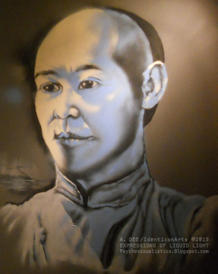
 |
| Download Showcase Flyer (front)—‘Right-Click’ (or ‘Ctrl-Click’ for Macs) on image, then select option. |
 |
| Download Showcase Flyer (back)—‘Right-Click’ (or ‘Ctrl-Click’ for Macs) on image, then select option. |
AUGUST 2014 - DRAGON LORD — SANS PANDA!
PIMP SHUEI KUNG-FU BAR – THE SEQUEL
Yes, I came back for two reasons. One, to paint the front of the bar, and two, to paint a canvas live at the opening.
Slash wanted something eye-catchingly simple yet effective — it was going to be ‘lower down in the mix’ after-all — so what better iconic image for a Kung-Fu-themed bar than a dragon. Slash’s option to go for one that’s pink was a bold choice that paid off, as it went with the look, feel and ethos of the bar beautifully.
 |
| The basic outline of the dragon. |
 |
| The dragon, close to completion. |
 |
| Just before the grand opening, in relation to to the other mural in the bar. |
JACKIE CHAN-VAS
For the opening night of the bar I was asked to paint a canvas live outside. I decided to go for a Kung-Fu movie icon. Though there are many to choose from, I opted for painting Jackie Chan. Rather topical considering that he was due to be in the UK for a a series of appearances, including a Q&A session for a screening of one of his movies at the Prince Charles Cinema in the West End.
Anyway, here it is in stages. As for the finished piece, I’ll post that up some other time!
 |
| Laying the foundation of the canvas’s colour-scheme. Not my usual colour pallete. |
 |
| The formation of certain strong tones serves as a basic influence for the next stage. |
 |
| …A feeling of energy and of movement; flowing freely, despite apparent confinement of the ‘four walls’. |
 |
| With the background done, it’s on to the portrait itself. |
BONUS...
Towards the end of the night, just as I’d finished the canvas, one of the staff at Pimp Shuei asked me to spray the logo onto his back and front. I laughed it off thinking he was joking… the look on his face told me he wasn’t. Always keen to try out new things with paint, I happily obliged, spraying him freehand in a few colours that were sure to stand out. He really liked it and it became a talking point for the rest of the night.
 |
| A staff member requested I spray him with the Pimp Shuei logo… |
 |
| That’s spray-paint, mind, and it’s permanent! |
HOWDY CONTROL ROOM
Back to a graphic story concept that’s been in the works for a while.
This is a simple scene where the protagonist locates a Control Room within the base where he’s being held, searching for a way out.
 |
| Manny inside a Control Room within the base. |
JULY 2014 - FESTIVAL STARS & KUNG-FU BARS! …+ BATMAN!
AVANT GARDEN SUMMER MUSIC FEST!
Well, not too sure about the stars of the first one but we definitely got to grips with a little Kung-Fu creative action!
First off, I got invited to paint at a music fest called the Avant Garden that was scheduled to be held out in the country but then had the plug pulled on it by the council a couple of weeks before. Not deterred, the owners shifted the venue to a large old pub in South-East London that had a huge space out the back. Sorted!
The vibe was great, there were some slamming tunes and a good time was had by all. Yours truly, in the spirit of reflecting the fun vibe there chose to paint a jester character from a story called The Stuff of Legend. It was different, and myself, as well as the organisers and party-goers loved the end result.
 |
| Once the outline was done on the Jester, filling in the colours of his costume could begin. |
 |
| The detail on the body is now complete. |
 |
| The facial detail begins. |
 |
| A close-up of the finished face. |
 |
| The Jester gets down at the Avant Garden. |
 |
| Jest a few embellishments at the end of the wall…sorry! |
 |
| A chilled evening caps of an enjoyable event. |
Painting the Pimp Shuei Kung-Fu Bar has to be one of the most exciting and interesting projects that I’ve done in a long time.
Initially, there was a lot of going back and forth, both in terms of character choices and even the layout of the bar. However, it all worked because we both agreed that the the development of the place — even the painting — was to be ‘organic’.
It wasn’t about just going in there with a bag of spray-paints and pulling out a couple of nice pieces from the bag, it was more than that, much more!
Once the internal structure of the bar was decided, Slash created a visual mockup in SketchUp, a free 3D architectural visualisation programme to help communicate his ideas. I then composited my designs onto the walls of the mockup, using that as a springboard for ensuing discussions about the artwork.
The following images show the progress of the project from inception to completion.
 |
| One of the early views of the bar, created in SketchUp. |
 |
| The same scene composited with the proposed designs for the walls. |
 |
| The Angela Mao image that was used for the wall, both the original, as well as its graphic interpretation. |
 |
| The final Angela Mao design that was used. |
 |
| Pimp Shuei bar-owner, Slash, poses in front of the completed Angela Mao painting. |
 |
| Kung-Fu iconic villain, Hwang Jang Lee, in Silver Fox action pose. |
 |
| The Hwang Jang Lee image used for the wall, both the original, as well as its graphic interpretation. |
 |
| The main final image design for the Hwang Jang Lee painting. |
BATMAN - 75TH ANNIVERSARY!
I was commissioned by the geek’s paradise movie memorabilia store known as Forbidden Planet, to do a live Batman painting in their flagship store window in London’s West End.
Despite the tight spacing, the weather was great, the staff were friendly and helpful and it wasn’t even hot inside. Plus, to top it all off, they even had a ‘Michael Keaton era’ Batman and Joker outside as added attractions, getting into character and posing for photographs with the public.
Here are some great pics taken by Samantha Jones (89batman) taken from both inside and outside the venue during the event, as well as some of the actual painting in progress, further down.
 |
| The Dark Knight poses! |
 |
| The Joker joins the party. |
 |
| Caught! Purple-handed. |
 |
| Batman and Batfan ready themselves for the cameras. |
 |
| Hero and Villain see themselves captured on canvas. |
 |
| A character study of those who remain behind the mask. |
 |
| The Joker admires his portrait…I think! |
 |
| Obvious Batfans gather for a group shot. One of many during the day. |
 |
| Life imitating art…imitating life… imitating... |
 |
| Giving casual passers-by a heads-up on what was going on in the window. |
…Speaking of which, here’s a partial documentation of the canvas.
 |
| A detail shot of one of the canvas panels, partly sealed with masking tape. |
 |
| The finished frame and captured image—a silhouette of the Dark Knight. |
 |
| The detail complete with iconic Bat-logo. |
 |
| The finished canvas, complete with Hero and Villain. |
JUNE 2014 -...THE HARDWARE THEY FALL
HARDWARE SHOP
For me, having a range of tools in my creative toolbox means having freedom of expression across varying creative disciplines, so this month found me working on a lot of 3D graphics as opposed to painting.
After months of prep I’m finally entering the ‘third dimension’ with the visuals of this graphic story that I’m working on. There’s a 3D animation software package called Carrara that I used to model this scout ship. In the story, it’s instrumental in helping the protagonist gain his temporary freedom away from his place of captivity.
 |
| SCOUT SPEEDER I—Once the modelling was done in Carrara, I rendered the image out, imported it into Photoshop and then added some wear and tear to the ship using mainly the Dodge tool. |
 |
| SCOUT SPEEDER II—Here’s another rendered image in relation to the previous one. This one shows the scout ship in flight, noticeably without the wear and tear on the engines and fuselage. The motion blur was added in Photoshop. |
MIFFED! PROMO IMAGE
I’m not sure how long I’ve had this image in mind, but it probably goes back nearly five years to when I was writing part of the treatment to the MIFFED! graphic novel. That was originally set to be around 200-250 pages.
I wanted to have a scene where she’s alone in the woods and is caught by an ominous light, emanating from within a deep gorge in the forest. I wanted the scene to be part eerie, part serene. Both of which I feel captures the mood being depicted, so it’s great to be able to finally get to it and make it happen.
 |
| MIFFED! ‘Promo’ Image—The protagonist of the story, caught in a place of contemplation and discovery. |
MAY 2014 - THE FORMULA FOR SUCCESS?
STREET ART FOR INCLUSION URBAN ART PROJECT – SUMY, UKRAINE
If someone had told me back in 2012 that sometime in the near future I would be travelling on my own to Ukraine, at a time when it was −14 to −20 degrees below zero, I would have said you were totally nuts. Especially after reading articles such as, Sol Campbell warns fans to stay away from Euro 2012. Yes, in light of that article and all the rumours, I had justified reservations about travelling to the small city of Sumy in north-eastern Ukraine (about 30 ‘clicks’ from the Russian border) in the middle of winter; yet I still went, and I’m glad I did.
My first trip was a planning meeting, the second was implementation of an Urban Arts project on art and activism with other participants from the UK, Ukraine and Poland.
The subject of the mural we did was on pollution and the environment, depicting how chemical pollutants from factories and industry are affecting not only the environment but the health of the people of Ukraine. Hence, the chemical formulas/equations and the naming of pollutants such as formaldehyde (ФОРМАЛЬДЕГІД − see image 3).
I’ll go into it in more depth on my other projects website, but for now, here are a few images.
 |
| A. Dee (The Artful Dodger) working on the painting of the lab flask image. |
 |
| Another big pollutant in Sumy, Ukraine − H2SO4, more commonly known as Sulfuric Acid. Here, the Russian name was given (Sernaya Kislota − СЕРНАЯ КИСЛОТА). |
 |
| The name of the city, Sumy (СУМИ) in Cyrillic, with formaldehyde (ФОРМАЛЬДЕГІД) written underneath, referring to its damaging connection to the city. |
 |
| The chemical formula for Nicotine: C10H14N2. |
 |
| Another illustration part of the mural showing the chemical compound of another pollutant. |
 |
| Part of the completed environmental wall mural image besides the local football stadium in Sumy—a. |
 |
| Part of the completed environmental wall mural image besides the local football stadium in Sumy—b. |
 |
| Part of the completed environmental wall mural image besides the local football stadium in Sumy—c. |
VISIONARI – RAI TV (ITALY) MARK II
Round 2 of this one for Rai 3 TV, as they liked the work I did so much for the first one they commissioned me for 2 others. This time, the artwork featured the portrait of Italian writer, Italo Calvino (known for his novel ‘Invisible Cities’ [Italian: Le città invisibili]) and a colour reinterpretation of the lithograph print, Relativity, by the Dutch artist, M. C. Escher.


APRIL 2014 - VISIONARIES – “COME SE DICE IN ITALIANO?”
VISIONARI – RAI TV (ITALY)
I’m not usually one for having what I would refer to as, “the sweet hook-ups” (golden opportunities through friends, acquaintances or recommendations), so when my girlfriend’s mother – who yes, likes my work – offered me the chance to do something for an Italian TV show called Visionari (Visionaries), I kindly accepted.
I was asked to do various full-colour graphic interpretations of 2 black and white images of Karl Marx. One of him at a young age, one of him older, as he’s usually depicted.
Basically, the premise of the show is one where the presenter, Corrado Augias, examines and dissects the thoughts and philosophies of some of the world’s greatest thinkers – “Da Darwin a Freud, da Leonardo da Vinci a Marx, da Santa Chiara a Beethoven, da Martin Luther King a Italo Calvino, Corrado Augias ripercorre le biografie e le “visioni” di alcuni dei più grandi fondatori del pensiero, della scienza e dell’arte moderna” (“From Darwin to Freud, Leonardo da Vinci to Marx , from St. Chiara to Beethoven, from Martin Luther King to Italo Calvino, Corrado Augias traces the biographies and "visions" of some of the greatest founders of thought, of science and of modern art”).
The programme I did the work for, on Karl Marx, can be seen here, with the artwork at these points in the show; 03mins, 11secs and 07mins, 45secs.
Special thanks to Olga and Valentina for this opportunity!


MARCH 2014 - FUTUREFEST SHOWCASE
Being a patron of an organisation like FutureVersity means occasionally being called upon to support or contribute to the cause – something which I do gladly. On this occasion, I was invited to give a speech and host an Urban Art workshop over in east London. The reception for both was great and it was good to actually be in a position to inspire the dreams and creativity of others.
 |
| East London Life mag FutureVersity Showcase preview. |
FOOTIE POSTERS – THE LINESMEN
This was the beginning of a series of posters, inspired by some graphic s work that I’d done for a guy over in Nunhead, South London also on the subject of football (no, I don’t mean soccer!).
There are 12 of them in the series, all qualifying World Cup teams. These are just a few of the main ones.


FEBRUARY 2014 - SUPER-FINE STAR WARS SHIRTS!
‘WE LOVE FINE’ STAR WARS COMP.
If you want to get my immediate attention, just utter the words, “Star Wars”! Simple as.
Whist looking around online for some Tee printers, I came across a site – WeLoveFine – hosting a Star Wars T-Shirt Design contest. I read the rules & regs – most of ‘em! – then entered a few designs. After they were submitted I decided to read the ‘small print’. The comp was only open to those in the US. Doh! Kids, that’s Lesson no. 387 – Always read the small print.
Anyway, it was still a nice creative exercise, and one which I enjoyed completing.


JANUARY 2014 - LAYDEEZ DO COMICS...
Towards the end of 2013, I decided to attend my first Laydeez Do Comics event, even though I had known about them for over 5 years! So what prompted me to delve into the depths of my ‘to-do list’ and finally show up? Well, simply put, it was the fact that I felt I finally had something to share with the rest of the world in the form of my MIFFED! graphic story – see JAN/FEB 2013 – which I was making steady progress with.
I put together a presentation of that as well as my creative journey thus far and to my surprise it was well-received, with the feedback on the art and story being more than encouraging.
 |
| Laydeez Do Comics Presentation - A little ‘splash page’ for the Cradle Of The Mind Powerpoint presentation at Laydeez Do Comics. |
NOVEMBER / DECEMBER 2013 - “50 NOT OUT!”
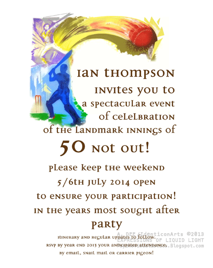 |
| BIRTHDAY INVITATION - A simple invitation for Ian’s up-coming 50th Birthday celebration. I’ve designed lots of invites before – some very elaborate and picturesque – but the simplicity of this one mixed with the cricketing image made this one a favourite. |
SEPTEMBER / OCTOBER 2013 - SKILLS TO BEAT
 |
| KING OF THE BEAT POSTER - This was a composite poster that I did for a filmmaker friend of mine that runs the King Of The Beat Hip-Hop music and film website. One of his latest projects is a documentary film called Looking For The Perfect Beat, so this was a promo image idea that I came up with for that. |
‘THE SKILLS SHOW’ PROMO BOOKLET
My creative partner, Olga and I, won a competition held by the Edge Foundation to host a series of workshops over 3 days at the NEC (National Exhibition Centre) in Birmingham in November to over 1,500 school children and college/uni students who were interested in careers in the creative arts.
A daunting task, but one, however, which was very successful, due to us being well organised, efficient and professional. We also had a couple of brilliant assistants on the second day which also helped!
 |
| THE SKILLS SHOW BOOKLET - The booklet which we put together giving background info on us as artists/designers as well as containing advice on “Where to next?” for the budding creatives we encountered. |
JULY / AUGUST 2013 - OLD SCHOOL RULES! CALDICOTT PREP SCHOOL COMMON ROOM
I normally venture into schools to run Urban Art workshops (usually in inner-city areas), so when asked to paint the common room wall of a prep school that specialised in various sports, I thought it would be interesting.
Indeed it was, I mean, Caldicott is a modern-looking set in Slough amidst 34 acres of land. When told that the 34 acres (an acre is about the size of a football pitch) was there’s it came as no surprise that past pupils included cricketer Andrew Strauss, poet and novelist, Malcolm Lowry and Ben Castle, British jazz musician and son of the late entertainer, Roy Castle.
I painted this at the beginning of the school’s summer break, so sadly wasn’t around to see the boys’ reactions when they came back at the beginning of the next school term.
 |
| Caldicott Prep School Common Room - The painting of the wall in stages, with the theme highlighting the various sports the school specialises and excels in. |


THE LONDON LOOK CANVAS
London in the summertime – on the rare occasions when we get decent summers! – is an awesome place to be. With this painting that I was commissioned to paint of a sunset in the City, I wanted to reflect that.
 |
| THE LONDON LOOK CANVAS (75 x 120cm) - The 3 London sites in view are the London Eye, Tower Bridge and the Shard. |
MAY/ JUNE 2013 - SOMEWHERE… BEYOND THE SEA!
Being able to draw, paint, design graphics is great, but to me, any such work is elevated when there’s a sincere meaning or ‘higher purpose’ behind it. Such was the case when I did a large project with a musician and ocean activist around the theme of ocean awareness.
| AQUALISE LOGO - I was asked to redesign the label brand for an online oceanic-inspired music website, Aqualise. The original logo – used by the company before my involvement – is shown in grey. |
 |
| THE AQUALIZERS T-SHIRT SERIES - From producing the logo, I was then asked to design a series of T-Shirts for merchandising… |
 |
| THE AQUALIZERS T-SHIRT SERIES - From producing the logo, I was then asked to design a series of T-Shirts for merchandising… |
 |
| THE AQUALIZERS PROMO POSTER SERIES - This then lead to me creating Posters of characters for a possible series of children’s books… |
 |
| THE AQUALIZERS PROMO POSTER SERIES - This then lead to me creating Posters of characters for a possible series of children’s books… |
 |
| THE AQUALIZERS PROMO POSTER SERIES - This then lead to me creating Posters of characters for a possible series of children’s books… |
 |
| THE AQUALIZERS BOOK ILLUSTRATIONS - Then finally, I produced some book illustrations to go with the story. A story that I was actually asked to write! |
MARCH / APRIL 2013 - WHAT A RIDE!
A month where polarities are explored via those that work for the greater good; either through active duty in what’s referred to as “the real world”, or by becoming (super) heroes in the world of comic books, graphic novels and movies.
 |
| WELLINGTON 2 WATERLOO CYCLE RIDE LOGO - An aspect of the merchandising design produced for the Grenadier Guards Wellington 2 Waterloo Cycle Ride, taking place in September 2013. |
 |
| Iron-Man/BatMan - Spray-paint & acrylic on canvas (174.5 x 91cm) - A painting produced for a film festival held in conjunction with a promo event at London’s Forbidden Planet, the world's largest and best-known science fiction, fantasy and cult entertainment retailer. |
JANUARY / FEBRUARY 2013 - NO BATTERY-OPERATED RABBITS HERE!
A digital illustration project that sees a Hunter get far more than he bargains for whilst out hunting one day in the woods.
 |
| MIFFED! GRAPHIC NOVEL PANEL - In the graphic novel, this is one of our first glimpses of the story’s Protagonist. |
THE DRUMS OF WAR BOOK COVER
Having recently discovered that I have a talent for writing, I decided to embark on composing an epic poem about Love and War. I had been working on this poem for a while (since early 2011), putting it together with a series of sketches in the hope of eventually releasing it as a book.
What is it? Well, it’s an epic poem called The Drums Of War, speaking of the call to arms that appears to be inherent in all men. A soldier speaks of this, his hopes for a life beyond the battlefield as well as the realisation that although his life may indeed be his to give, the recipient may not be his intended...
 |
| The cover for the proposed book of the poem, The Drums Of War. |
 |
| The 54th Mass. Regiment of the American Civil War. |
 |
| The battle rages on in the trenches of WWI. |
 |
| The Drums Of War page 1 Epitaph. |
DECEMBER 2012 - ‘ORDO AB CHAO’ FOR HOUSE OF COMMONS ART COLLECTION!
Being commissioned to paint a portrait in spray-paint of the Deputy Speaker of the House of Commons is one thing, but being told that it will sit in the House Of Commons Art Collection, alongside historical works of Kings, Queens and other political figures is something else. Especially as it is the first piece of urban art ever to do so!
 |
| Ordo Ab Chao - Spray-paint & acrylic on canvas (126 x 158cm) - A commissioned painting for the Deputy Speaker of the House of Commons, Nigel Evans MP. |
The meaning of the Painting...
Often, when painting concept pieces, I’m compelled to write the meaning behind them, even if it’s for my own reference. With this one however, even though it was meant to be a standard portrait, my approach to it was as though it was a concept painting. Hence, the information below.
ORDO AB CHAO – From Chaos Comes Order
The Latin title refers to the centuries-old edict that out of chaos comes order. We can take this to be on a cosmic/universal level in reference to the Big Bang, or on a much smaller yet still relevant level in reference to human societies. In this context however, it shall refer to the subject of the painting, and the medium with which it has been created.
The main medium used in its execution is spray-paint. A medium normally associated with vandalism; chaos; the decaying of social order, so it is ironic that such a medium would be used to represent such an iconic symbol of civilised society and social/political order. Also, anyone that has used aerosol paint can attest to its overwhelming freedom, both in the way it is used and how it behaves. This is probably a testament as to why it appears to only appeal to a certain section of society.
In the context of this painting however, the perception may remain the same though its perceived function as an instrument of destruction has been reversed. Its role as a chaotic liquid has been transformed into a solid with a more ordered purpose.
The sky on the left of the painting represents an impending political storm, because like any storm these will always come and go.
The central subject, Mr. Nigel Evans, stands firm in his role as Deputy Speaker of the House of Commons in front of the national symbol of social order, shown by the emblem of the Crowned Portcullis, representing both Houses of Parliament – the House of Lords and the House of Commons.
Beneath the House on his right are the seats where the Parliamentary debates take place which help determine the fate and course of the nation. On his left, seemingly breaking through the painting are colours representing the tumultuous stimuli to be found within; the chaos of the debates between the main political parties. The purple – a colour which in many cultures is symbolic of power – permeates the chaos. It is also a combination of red and blue, the colours of the two main parties.
So on one side you have the ‘arena’, and on the other, the chaos, with the Deputy Speaker of the House as the fulcrum, maintaining balance and order.
Lastly, this can be seen as a reflection, for as with the nature of politics, there will always be parts of it you do like, and parts of it you don’t.
©A. Dee - Oct. 2012
OCTOBER / NOVEMBER 2012 - “ONE RING TO RULE THEM ALL…!”
 |
| THE LORD OF THE RINGS 3D ILLUSTRATIONS - One of my first forays into the world of 3D animation, using the industry standard 3D animation software, Maya. Coincidentally, it was also used to make The Lord Of The Rings movie trilogy by Weta Digital. |
 |
| THE STUDY (WINDOW) - I wanted the look of a ‘classical’ English study with a timeless quality to it. So after thumbing through various books and magazines for the relevant source material and ‘look’, I was struck with the idea of basing it on something from the realm of The Lord Of The Rings’ Middle Earth, which proved to be perfect for what I wanted. This one (as with the Study below) was based on Bag End (Bilbo and Frodo’s home in The Lord Of The Rings). |
 |
| THE STUDY (DESK) - Rather than going for a ‘neat and tidy’ look for the desk, I opted for something akin to how I would perceive myself working in that type of environment. Something a little more cluttered. |
 |
| THE STUDY (DESK) 2 - A ‘processed’ version of the Desk’s rendered image. |
AUGUST/ SEPTEMBER 2012 - B-BOYS, MAKE SOME NOISE!
This month, we venture into the world of Hip-Hop and B-Boying, with a couple of bold posters.
 |
| B-BOYS BEWARE! POSTER - A Poster made for a B-Boy Championships event in Europe. The idea was to make it look like something that could be used in a sportswear ad. |
 |
| WEAPON OF CHOICE! POSTER - Another Poster made for a B-Boy Championships event. It was a follow-on developed from the initial idea of having a sportswear ad-type design. |
JUNE/JULY 2012 - YOUNG, GIFTED &...
| ‘NATRULY GIFTED’ LOGO, MANAGEMENT COMPANY, KENT - It can sometimes be a little frustrating when a client sets out to poorly describe what it is that they are after, when you know that if they would be better served by just providing an image, even if it’s something that they’ve seen on the net. Nevertheless, as our line is creative solutions, we welcome the challenge. Such was the case with this one, where the client through various phone conversations described what she wanted. We went with what we felt was the right direction, taking her needs for the logo (such as her initials ‘NG’) into account and she loved the finished design. |
 |
| DUENDÉ CANVAS (60 x 90cm) - A commissioned canvas painting produced with spray-paint for the home of a contemporary dancer and actress. |
MAY 2012 - CORPORATE ADVENT-URES…
This month we get back on the corporate trail with office murals and logos. Logos are something which we have done much of over the years, though this one will be the first to be featured here.
 |
| LONDON 2012, ADVENT SOFTWARE BREAK-OUT ROOM, LONDON W1 - We were commissioned by a multi-national software company to decorate the wall of their ‘break-out room’ of their new Central London Head Office. They wanted the piece to be a ‘celebration’ of London, featuring a few of the main buildings and monuments that London is known for. The first 2 images (above) are of the initial design that was submitted to the client for approval and the design after being composited onto the wall to be painted, so as to give them an idea of how the finished piece would look. Although much of the original architecture has muted or grey colour-tones, the client wanted an injection of colour into the piece. It had to be eye-catching but not distracting, as the space used was for relaxing during breaks and lunch hours, whilst at the same time, it had to fit in with the decor of the room. A pleasing balance was struck and the client loved it… result! |
 |
 |
 |
 |
 |
 |
 |
 |
 |
 |
------------------------------------------------------------------------------------------------------------------------------------------
APRIL 2012 - “HERE BE DRAGONS…!”
Although we do a lot of painting throughout the year, we often get called upon for our other creative outlets, namely graphic design and illustration. This is good because with each project often being different from the last, it keeps us sharp, creative and focused, as we often say to each other, “How can we do this one different this time?” So the desire to push ourselves both creatively and technically is always there.
 |
| WELSH DRAGON, SHENFIELD, ESSEX - This one was simple enough. The client was a fan of Welsh rugby, and so wanted the Welsh Dragon (as depicted on the Welsh flag) and the number ’23’ incorporated. The number is there; see if you can spot it. |
------------------------------------------------------------------------------------------------------------------------------------------
MARCH 2012 - AS PLAIN AS BLACK AND WHITE…
That seems to be the theme this month, black and white portraits. Painting faces in black and white - as with black and white photography - causes you to focus on the details, as opposed to allowing yourself to be distracted by colours, as you would when viewing things normally. So as well as each being an exercise in reproducing facial details accurately, they became exercises in creative discipline.
 |
| GAMES PEOPLE PLAY, GAMES ROOM, HARTLEY, KENT - Initially the thought of masses of red hair, a black and white face and a vibrant club setting don’t seem like obvious choices for a composition for a games room. Indeed, they are not, so the challenge here was putting the various elements together in a way that was both tasteful and visually exciting. |
 |
 |
| BUDDHA FACE, BARKINGSIDE, ESSEX - I suppose that sometimes as balance between materialism and spirituality (no matter how loose) can seem contradictory, although the key word here is ‘balance’. The client here, although steeped in wealth, wanted an instant reminder for whoever entered his home that his life had a bigger focus than the one apparent. It was also a humble reminder for us painting it. |
FEBRUARY 2012 - OLD SCHOOL Faces
The highlight of this month’s project run was when we were asked to come and paint some iconic faces images in the halls and communal areas of a renowned film school.
See the images below…
 |
| ICONS OF THE SILVER SCREEN, FILM SCHOOL, LONDON - When a call comes from a prestigious film school to decorate their space with images of your heroes, it’s hardly something you have to think twice about doing. This was the case with this commission. It was made all the more interesting in that we allowed to include film quotes from accomplished directors. For us it gave us another angle that made it all the more interesting, in that it gave you something to think about as well as something to feast your eyes on. Here’s a selection of our favourite ones from the series. |
 |
 |
 |
 |
 |
------------------------------------------------------------------------------------------------------------------------------------------
JANUARY 2012 - ’SKULKING’ Fish At The Palace
January usually starts off slow for us, as it takes time for people to get back into their routines after the Festive celebrations that precede them. This year, however, we launched straight into the New Year with a slew of commissions. The ones featured here were the more interesting of the bunch.
 |
| ‘COLOUR-SKULL’ CANVAS, NOTTING HILL, LONDON - This was another painting based on something that a client had seen. In a way, it was similar to the ‘Dia De Los Muertos’ image that we had done previously, except that this one had more of a feeling of stained glass. The client requested that the background be minimal so as to further enhance the skull. |
 |
| ‘KOI FISH’ DOOR, NEW X, LONDON - The client had a fascination with Japanese Koi, probably because they are a symbol of good fortune and perseverance. Also, because of its strength and determination to overcome obstacles, it stands for courage and the ability to achieve high goals. He already had many images on his walls so he opted for something basic on his door. |
 |
| THE PALACE, ACTON, LONDON - This one was simple enough; done by the numbers. Still, it was an interesting contrast to the minimalist decoration that surrounded it. Oh, and the reason behind the wolves heads? Sorry, I forgot to ask. |
------------------------------------------------------------------------------------------------------------------------------------------
DECEMBER 2011 - COMMERCIAL Mural Projects
Coming up to end of the year, our work became a mixture of personal and commercial, though we treated each with dedication and sincerity, no matter what they were paying.
One of the fun things about this line of work is seeing the faces of the clients after the job is done, as most are amazed at what can be achieved with just spray-paint. For us, the further removed the subject matter from the medium (creative materials, which in this instance, refers to spray-paint), the better.
 |
| ‘KAUFFER-CAPEK’ MURAL, N. FINCHLEY, LONDON - This was actually a combination of the work of 2 artists (Edward McKnight Kauffer and Josef Čapek) that was kindly put together by the client’s daughter in Photoshop. The resulting combination was then used as a basis for the mural. |
 |
| AS THE CITY SLEEPS, COLLIER’S WOOD, LONDON - This was based on one of my own canvas paintings that caught the eye of the client. They liked the impression of it but wanted to have it done on a larger scale onto a wall in their dining area. |
 |
| ‘RIO & KEYA’ CANVAS, NEW X, LONDON - This was an Xmas present for twins to go on their room wall. The colours used had been specified beforehand so that it would match the decor of their room. |
 |
| JAZZ CLUB, HAMMERSMITH, LONDON - With this one, all the client specified was that he wanted a collection of jazz images done on 2 paintings for his jazz club… oh, and that they needed to be done before the 31st of December as they were having a huge New Year’s party. |
 |
 |
| FAMILY PORTRAIT MURAL, HOLLOWAY, LONDON - The request for this one seemed a little odd to us, not because of the subject matter, but because it was a birthday present for a 14 year old boy. He was into animation and so his mother thought that it would be a good idea if characters of their family were painted onto his bedroom wall. They were away whilst I was doing it so I don’t know what his reaction was. Personally, I had a suspicion that it may have been his mother’s way of discouraging him bringing girls back in a couple of years! I mean, as a teenager you’re hardly likely to want to do anything with a life-size image of your mum staring down at you, are you? |
------------------------------------------------------------------------------------------------------------------------------------------
NOVEMBER 2011 - INTERIOR Mural Projects
With the decision to ease up on the mural projects to pursue other creative outlets, we became quite selective about the type of work we would take on. Continuing our ethos of showing Honour Through Spray-Painting.
 |
| LIVE FAST, SK8 YOUNG, HARTLEY, KENT - Done for a young person’s bedroom, this was initially to feature images of free-running, BMXers, and other extreme sports that the boy was into. Although nothing was said, I think the boy’s mother opted against it as she didn’t want to give him any ideas. After all, he was only six! |
 |
| BUDDHA, CANNING TOWN, LONDON - The idea - and image itself - came from the client. It may have been based on something he had seen. Nevertheless, We still sought to paint it as if it had originated from ourselves. Giving it the care and respect we felt it deserved. |
------------------------------------------------------------------------------------------------------------------------------------------
OCTOBER 2011 - HOME INTERIOR & EXTERIOR Mural Projects
As promised, here are a few more of our favourite mural projects, some from the KG run. One or two were done on canvas whereas most others were done in people’s homes. It’s been a good experience, and we hope you enjoy viewing them as much as we enjoyed painting them.
Till next time.
The True To The Game team.
 |
| STEVE McQUEEN, ‘BULLITT’, SHINFIELD - The guy this was done for a definite care enthusiast who had a passion for fast classic cars, and the Mustang driven by Steve McQueen in the film Bullitt was one he particularly liked. So as well as painting the Mustang itself he wanted me to also do a pic of McQueen from the film. One of my favourites, due to the subject matter. |
 |
| JELLY BABIES, SHINFIELD - The partner of the car enthusiast also had a passion… for jelly babies! So this was painted onto one of the walls of their kitchen, complete with an image of one of jelly babies with their head bitten off! |
 |
| GARDEN SHED DOOR, REDBRIDGE, ESSEX - Sometimes, when you can’t actually visit a place the next best thing is to imagine it… or, have someone come and paint it. The woman this was done for had a passion for travel and sun-soaked far-off places. As getting there is not always going to be an option, why not have your own window into that world? - Courtesy of an artist’s hand. |
 |
| BASKETBALL DIARIES, ELSTREE - The father of two teenage boys who had a passion for dolphins and basketball commissioned this one. They had no idea about it, so I started it around lunchtime and finished in time before they were due home from school. Their father told me they were so excited when they saw it and absolutely loved it. |
 |
 |
 |
 |
| P*SSED DUCKS! WAPPING, LONDON - The idea for this commission came from the two duck ornaments. The purchaser of them had a small wall in a small garden that she wanted a mural on to enhance them. Afterwards she said that it came out much better than she expected, which is always good to hear. |
 |
| BUTTERFLOWERS, W. HAMPSTEAD, LONDON - Painting murals with aerosols doesn’t have to feature loud, vibrant colour schemes. Sometimes it can be something quite subtle, enhancing the natural beauty of its surroundings, as seen here. A special thanks to Jacky for providing the lovely photos. |
 |


 |
| ‘ABSTRACT’ CANVAS, CHERTSEY - There’s no title for this one. The brief was just to come up with something abstract, using metallics, beiges and light browns, with maybe a few splashes of bright colour here and there. This painting was more about capturing the essence of what the client wanted to feel when looking at it… it was spot on. |
 |
| MICHAEL JACKSON, CAMBERWELL, LONDON - The commissioner of this one was definitely what could be termed an obsessive fan, but not in a creepy way. She spent a lot of time out in the garden with her son and so wanted something beautiful that she could look at. What else than 3 versions of Michael Jackson at iconic stages of his career. |
 |
 |
 |
SEPTEMBER 2011 - KG Projects Gets Under Way!
That being said, we're really enjoying it. It's been a lot of hard work, but the scope and variety of people's requests make it challenging, exciting and original, with no two projects being the same.
In mid-October, we're going to continue with giving people a taste of 'the story so far', in other words, we'll be posting up some more pictures of some of our favourite projects. So stay tuned and feel free to leave feedback and spread the word about what you see.
Till then, here is a selection from this month’s run.
The True To The Game team.
 |
| SUNSET BEACH SCENE, WATFORD - This one was done in the bedroom of a couple that were soon to be wed. It was commissioned by the groom who said that his wife-to-be had not even see the house yet! He was sure she would like it as she loved sunsets and the painting was based on one of their favourite memories. |
 |
| ‘300’ GRAPHIC NOVEL PANELS, HOLBURN, LONDON - The interesting thing about this one was that we were asked to paint a few scenes from the graphic novel by Frank Miller. Not the sort of thing you would expect to be done using the spray-paint, but the resulting painting was loved by the client. |
 |
| GEISHA, GREENFORD, UXBRIDGE - The couple that requested this one were fans of Asian art and culture so wanted something figurative with a serene, Japanese feel to it. Not too many colours and something that would fit in well with their red ‘feature’ wall. |
 |
| DIA DE LOS MUERTOS, TOTTENHAM, LONDON - The title translates as ‘Day of The Dead’ and is a Mexican holiday celebrated throughout Mexico and in other cultures around the world. During the holiday, family and friends gather to remember and pray for friends and family members who have passed on. This image was chosen because the client had a fascination with this style of Mexican designs. |
 |
| TEDDY, LOUGHTON, ESSEX - Just a simple painting of a boy’s name - no, not his favourite toy - in his room. This shows the initial design as well as the painting that resulted. |
 |
| BEAUTY WONDERLAND, LEYTON BUZZARD - Yes, I know. We’d never heard of it either. Still, our motto is “Have Paint Will Travel”, so that’s exactly what we do. This was painted for the young daughter of a local businesswoman who was ecstatic with the result. |
 |
 |
 |
| STREET ANGELS, THE LONDON AMBULANCE SERVICE, LONDON - Every once in a while, I get asked to donate a piece of work to a charity for auction. This I am happy to do as for me, a large part of having a talent or a gift is so that it can be shared or used for the benefit of others. This one, done for the London Ambulance Service was one such occasion. |
 |
| ‘THAT WHICH RESIDES’ CANVAS, BOND ST., LONDON - Although simple in appearance, this one was more conceptual in that it represented the client’s Chinese heritage - hence the dragon (a symbol of happiness, immortality, procreation, fertility and activity) and the Chinese symbol for Longevity. |
 |
| STAR WARS CHARACTERS, STEVENAGE - Initially, the child this one was done for wanted a whole host of characters, sort of like a ‘who’s who’ of the Star Wars Universe. But for the space provided it was asking too much, so I suggested having fewer characters for more of a visual impact, and it worked well. |
 |
| GEARS OF WAR III, STEVENAGE - The same family’s older son was very much into playing XBOX games and so wanted something that reflected that. |
 |
| ‘DARTH CONNER’ CANVAS, STEVENAGE - Once again the young son of this family was having another Star Wars painting done, this time on canvas. He didn’t know about this one, as it was due to be a surprise Christmas present. |
 |
| CONTINENTAL SHOP SCENE, REDBRIDGE, ESSEX - The family of this one had a garden shed that was mainly used by the children to play ‘shops’, so this was done to enhance that. |
 |
| LAUREL & HARDY, BECONTREE, ESSEX - Every now and again, we get something, which, because of its uniqueness, really appeals to us. Having grown up watching Laurel & Hardy, it was nice to get to paint them in a sort of ‘classic’ style not normally associated with the medium of spray-paint. |

 |
| POMEGRANATES, GOLDERS GREEN, LONDON - The woman requesting this one had a bit of a pomegranate obsession, and so wanted them featured ‘creatively’ on the wall of her kitchen. |
------------------------------------------------------------------------------------------------------------------------------------------
AUGUST 2011 - The ARTFUL DODGER's Debut Book Launches
It is an 'Old Skool' book going back to what many would arguably refer to as the 'golden' period of the London writing scene in the early '80s! So, if you are a collector, or have a feel for what was going on back in the day with regards to 1980s Aerosol (Art) Writing in London, then this is definitely for you!
Here's a small sample of what you can hope to expect...
JULY 2011
One of our artists - The Artful Dodger - can be seen in the Channel 4 Street Summer Promo. Street Summer is a season of programmes on Channel 4 throughout August taking a look at the contemporary urban arts scene, shining a light on street dance, urban sport, hip-hop culture and street art.
View the Trailer here
No comments:
Post a Comment